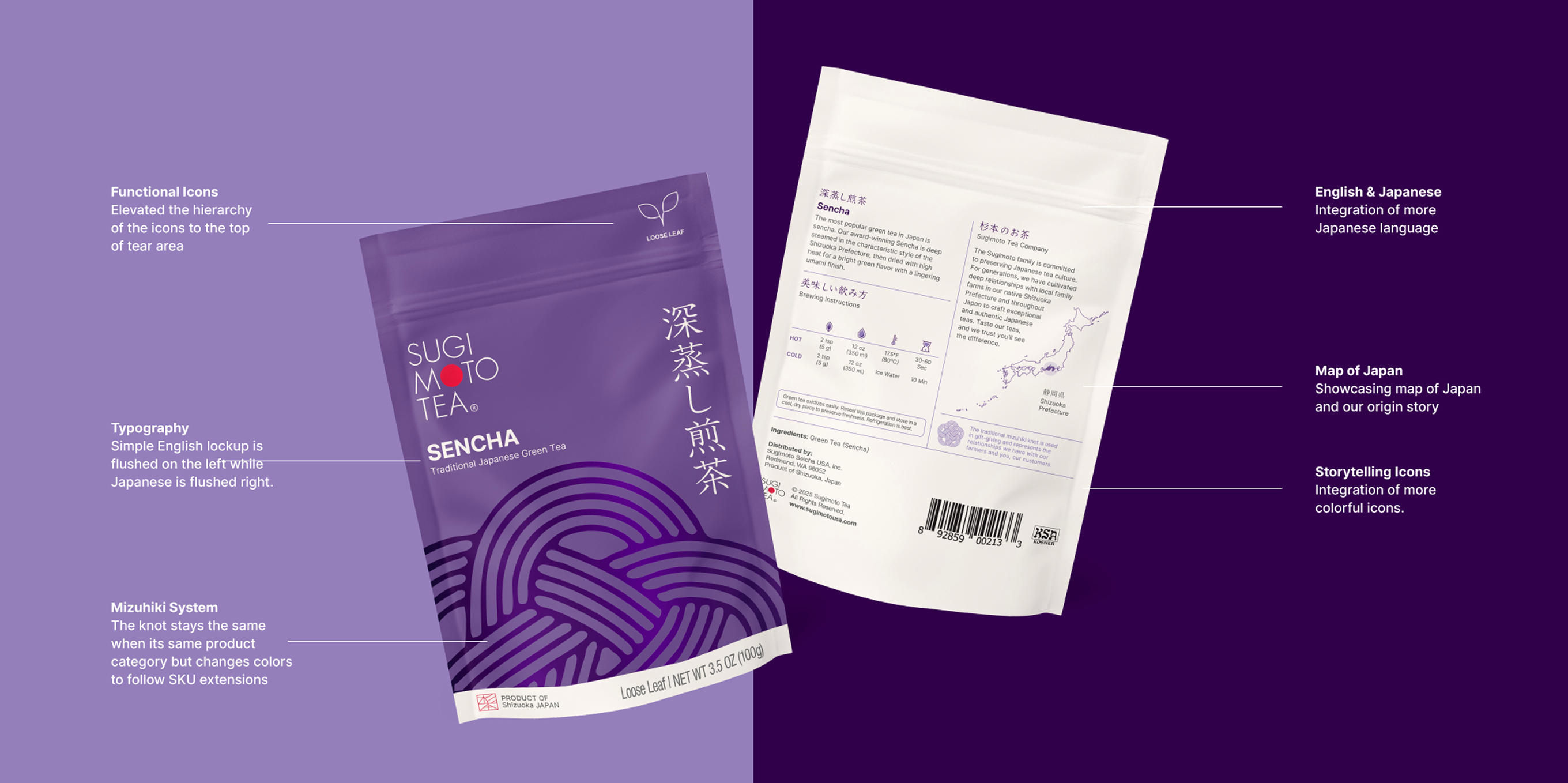
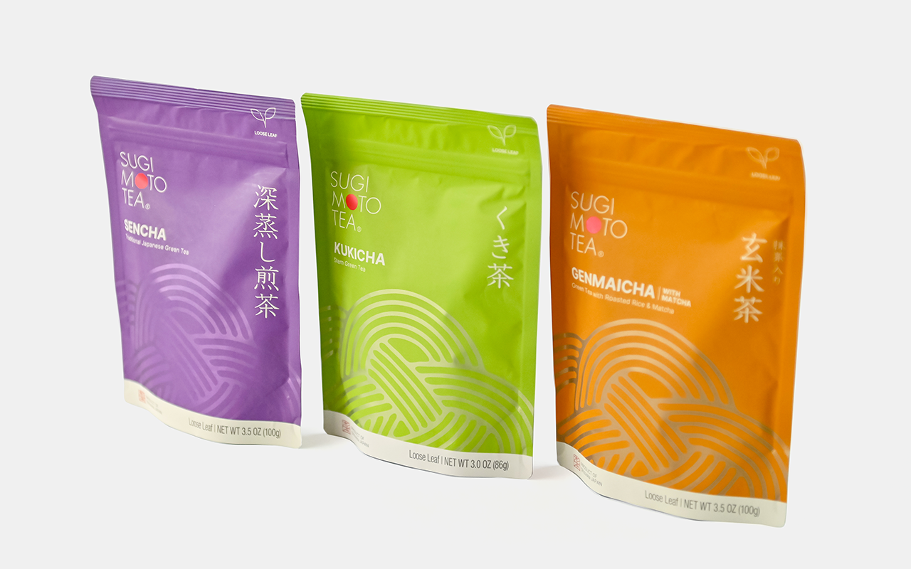
Packaging
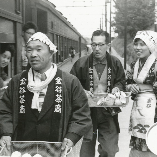
Sugimoto Tea Company
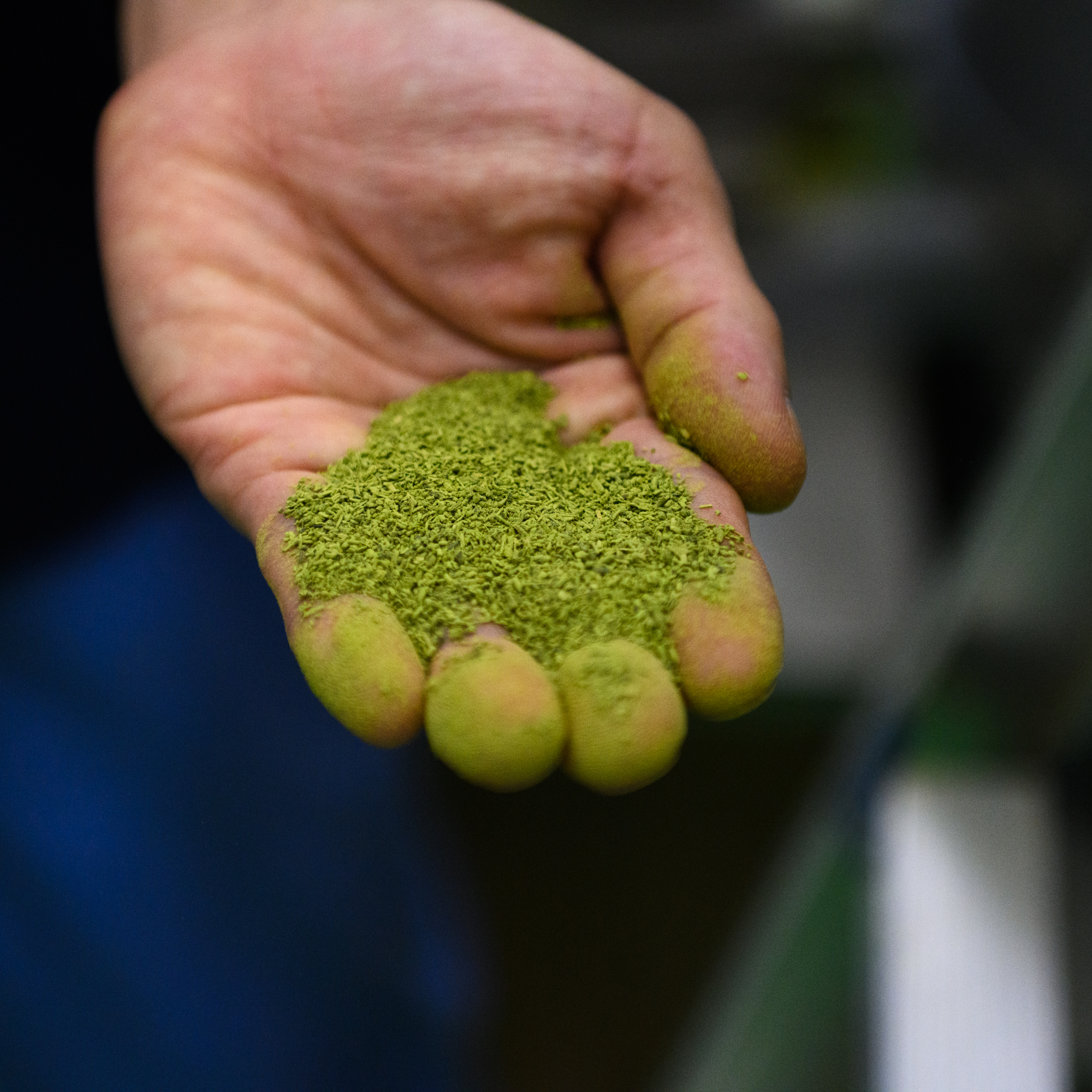
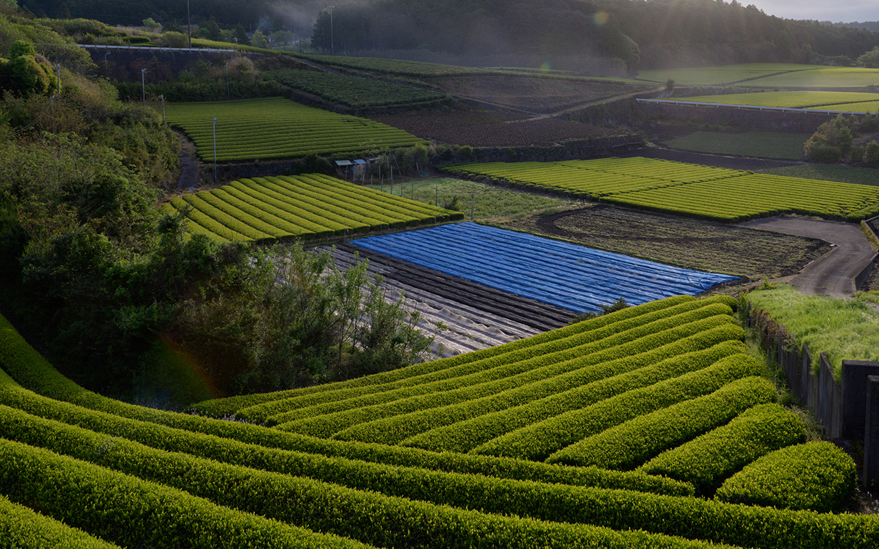
Tea making tradition, a family’s legacy.
When Sugimoto engaged us to redesign their packaging, we knew that meant they were entrusting us with their family name and their grandfather’s legacy.
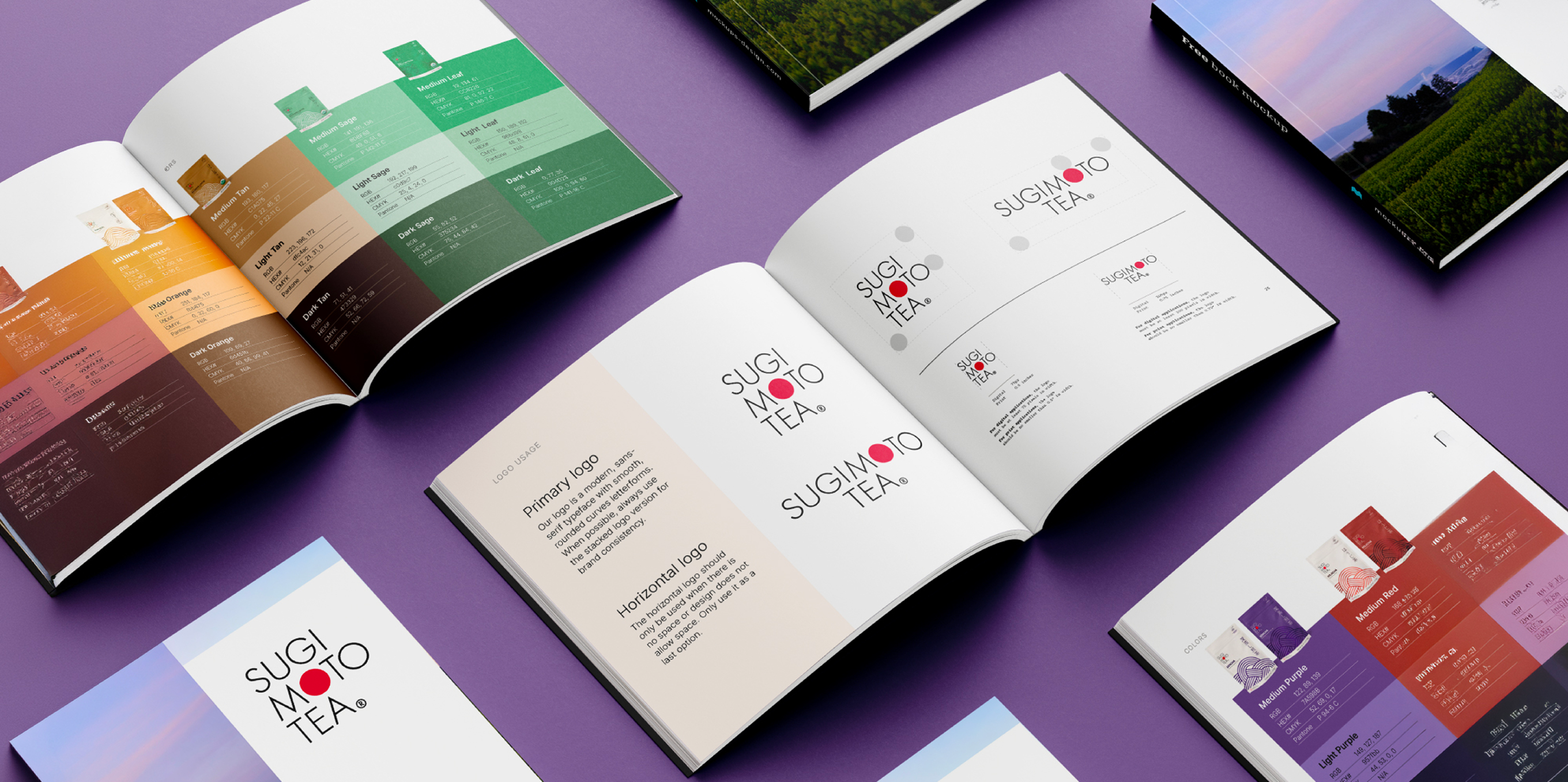
A rebrand grounded in heritage.
- Packaging
- Messaging
- Research
- Branding
What We Did
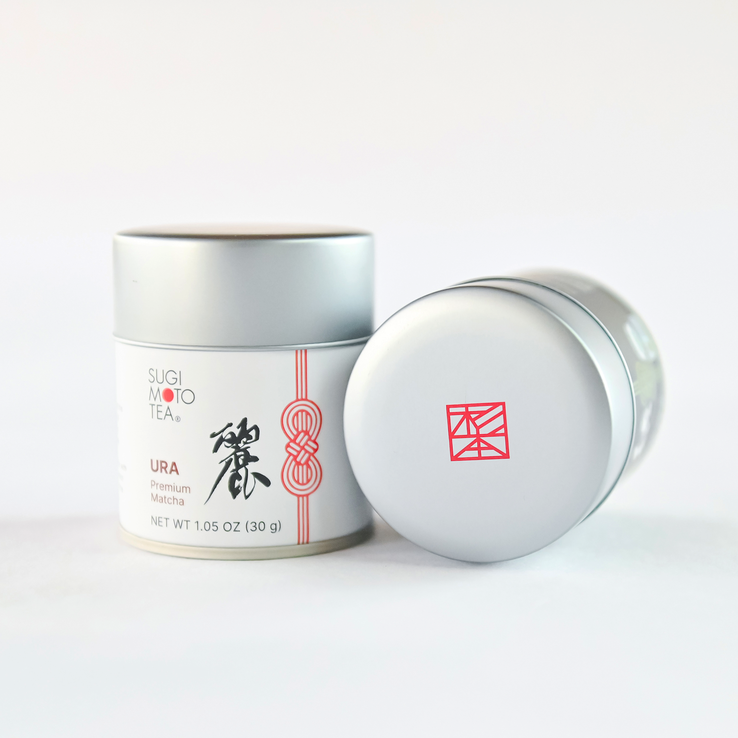
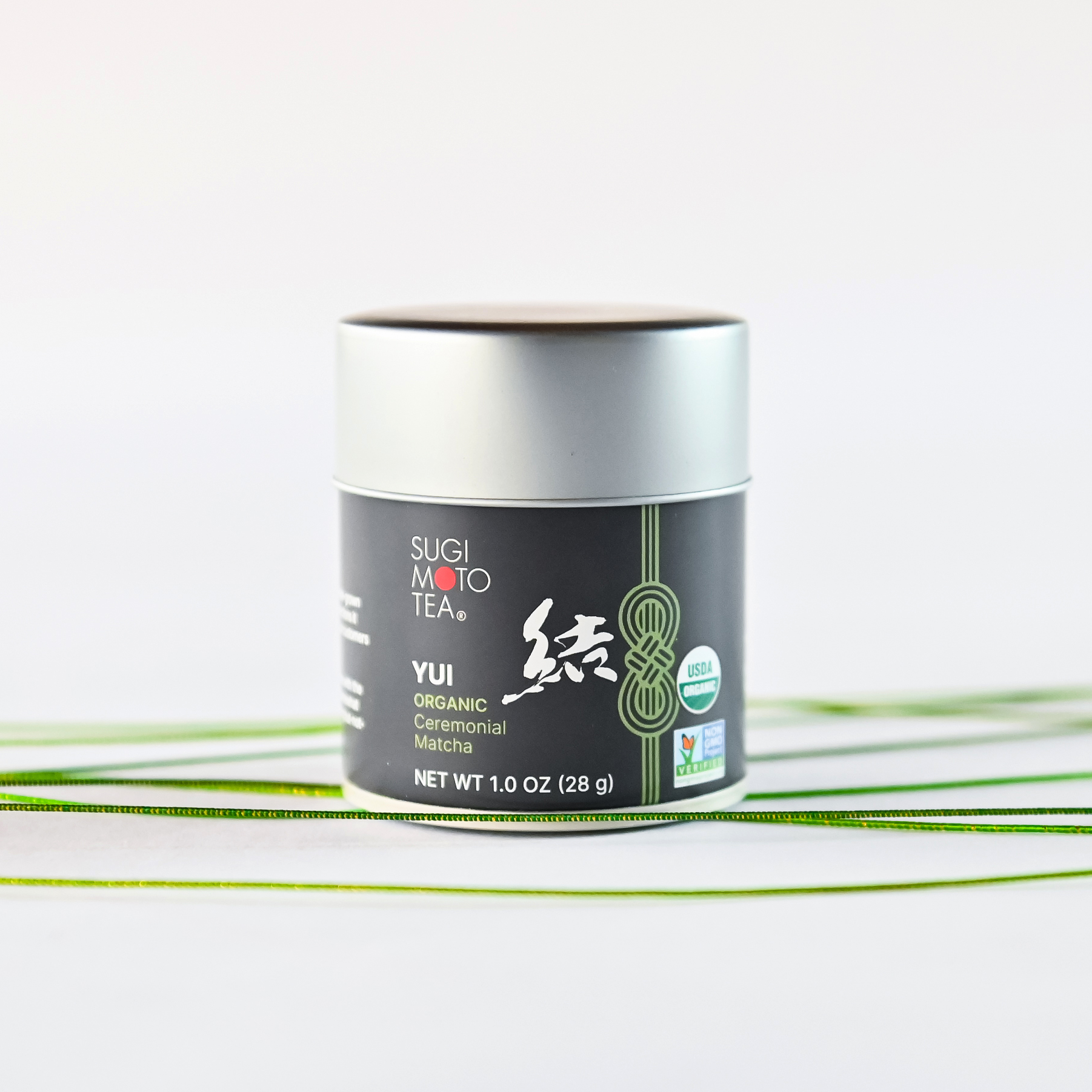
Mizuhiki (水引) knot tying is a traditional Japanese art form
And the perfect metaphor for Sugimoto
A design system needs to be simple enough to be shoppable and scalable while holding enough meaning to create a lasting impression. We worked through a number of concepts but the Mizuhiki (水引), a traditional japanese craft of knot tying, was perfect. The knots represent giving and gratitude. An ideal symbol for a tea maker steeped in tradition.
“Rupert helped us visualize ideas that were difficult to put into words and clearly express our brand voice through design. We truly appreciated their thoughtful approach and patience throughout the process."
Kyohei Sugimoto
President, Sugimoto Tea Company

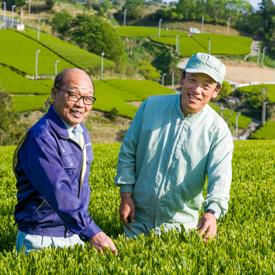
Designed to grow
Sugimoto is uniquely Japanese tea, we started there, with a sense of place. Soon we realized this was more about community and a commitment to traditions than a geography or a process. Sugimoto's mission is to preserve tea making culture; the product is simply the way in which they do it.
Did we get it right?
A handful of focus groups can tell us a lot. So we put our designs in front of tea lovers and quickly realized what we got right, and what needed work. It’s a great reminder that subtlety in packaging is great for designers, but tough for consumers. It turns out that distinguishing loose leaf from sachets needed an icon, the text, and a color change.
"Rupert was collaborative, easy to work with, and very clear in how they explained their ideas and recommendations. It felt like we were working as one team."
Julia Hurley
Marketing Coordinator, Sugimoto Tea Company